This topic contains 8 replies, has 2 voices, and was last updated by talisa 12 years, 2 months ago.
-
AuthorPosts
-
January 18, 2014 at 10:34 am #43581
Hi!
If I may ask – I need some Anki related help.
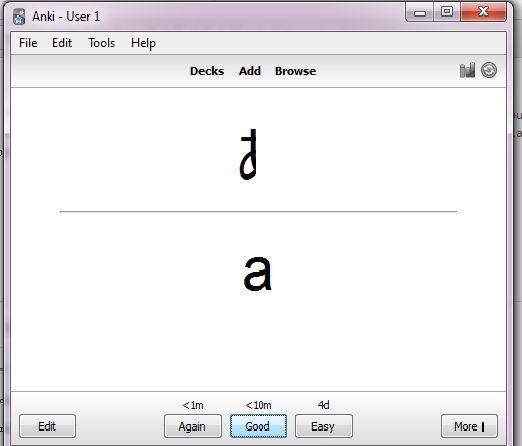
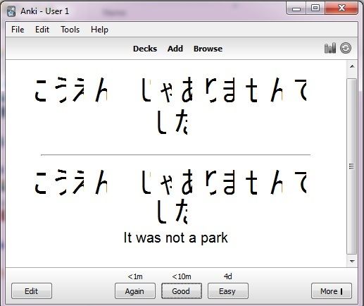
I’m not sure if I haven’t messed something up, but my Anki (Version 2.0.20) doesn’t properly display hiragana and kanji cards I downloaded from TF – I mean they look like “letters” are too large for the actual card and kind of go over the right side. Like this:


It’s like this with all sets I downloaded so far an with kanji ones it’s even worse (sometimes).
I’d appreciate any ideas about what might be wrong and any solution.
TIA!
January 18, 2014 at 11:45 am #43584Did you download the Japanese Language Support add-on?
I regularly post the following links when people make their introduction threads, looks like you didn’t make one so check out the following links:
Guide for using Anki 2 with TextFugu:
http://www.textfugu.com/bb/topic/guide-to-using-anki-2-with-textfugu/
Track your progress and share your ideas/concerns when you finish a season (gain a level ^_^):
http://www.textfugu.com/bb/topic/textfugu-season-completions-for-great-motivation-of-heart
List of additional Japanese resources you may find helpful:
http://www.textfugu.com/bb/topic/japanese-learning-resources/
List of Common Errors in TextFugu:
http://www.textfugu.com/bb/topic/common-errors-in-textfugu/
がんばって!
January 18, 2014 at 12:42 pm #43589I guess I kind of skipped that introduction part. ^o^
Yes, I installed Japanese Language Support add-on. And I already used your Guide for using Anki 2 :) (it was great btw ;)) Thank you for the additional info. Much appreciated.
But my Anki problem seems to lay elsewhere…
January 18, 2014 at 2:13 pm #43590That’s really weird.
Do 漢字 and ひらがな display properly on websites for you?
If they do, the only thing I can think of is to update your display drivers and perform a fresh install of Anki 2.
I don’t think either is likely to work though… :(
January 19, 2014 at 1:18 am #43606I agree, it’s weird *sigh* And yes, both of them display properly in websites.
I’ve re-installed Anki again and again. And I installed Japanese language pack on my Windows 7 thinking that maybe that would help, but no. Still the same.
I can make hiragana almost readable in the cards if I make their font (through Edit card) much smaller – then majority of them kind of fit into the card, but not all. Though they are really small then and not so easy to see. With kanji it’s more difficult, they need even smaller font to fit. It’s annoying.
I would almost I lack some shrift that is used in those cards (therefore the “letter” are so huge), but I checked and I kind of have all of them. *shrugs*
Anyway, thank you for your replies. ^o^
January 19, 2014 at 1:25 am #43607One other thing you might try is to change the font on the cards.
To do so click Browse on the Deck Menu.
Click on your Kana Master Deck on the left side.
In the right hand corner click on Cards.
At this point take note of the Hiragana, does it look normal or still weird?
There should be three boxes on the left. The middle one is titled Styling.
The second line should say the following: font-family: Arial;
Change this to: font-family: MS Gothic;
If it worked, in theory it should fix it on the display to the right, but I don’t know if it already looks normal for you.
In any case, close that window, close the Browse window and test your Kana deck to see if there’s a difference…
Let me know how it goes!
Edit: Finished this before I saw your latest post. It seems you are familiar with that function. Did you try a different font? Even if you have, try MS Gothic specifically.
-
This reply was modified 12 years, 2 months ago by
Aikibujin.
January 19, 2014 at 1:54 am #43612Awww, thank you for the long explanation, but yes I already had tried to change fonts (btw, in the Card Edit window they displayed the same way – not properly), just not to the right ones I suppose. So, YAY! MS Gothic works perfectly! THANK YOU! XD
I already figured as much before I read your last post and changed font to MS Mincho, but it seemed too ‘artistic’ to be good for studying purposes. So thanks again for MS Gothic suggestion. It looks great.
You saved me so much nerve-cells ^o^
January 19, 2014 at 8:34 am #43618Glad I could help. ^_^
Was the original font arial?
January 19, 2014 at 10:34 am #43623Yeah, Arial mostly.
-
This reply was modified 12 years, 2 months ago by
-
AuthorPosts
You must be logged in to reply to this topic.
